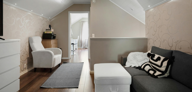
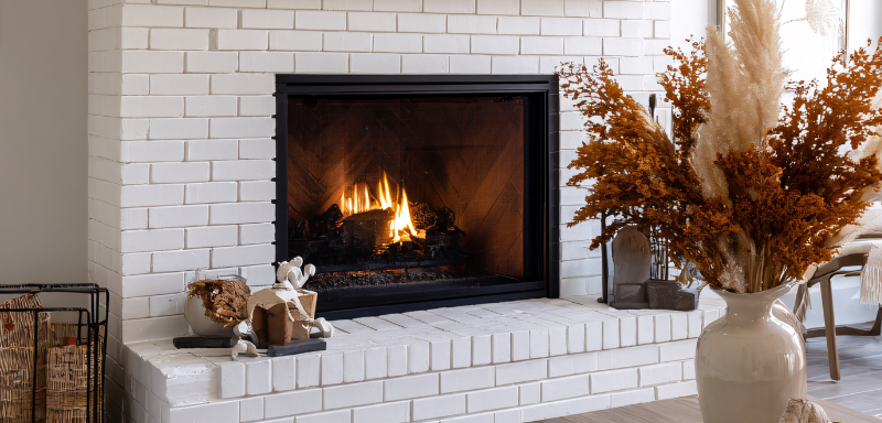
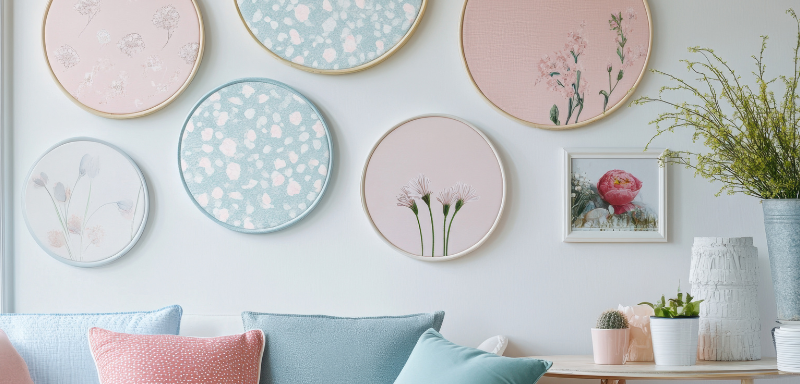
If there’s one thing that can completely transform the vibe of a house, it’s color. Whether on walls, furniture details, cushions, or decorative items, colors have the power to change a space in ways many people don’t even imagine. Today, I’ll show you how to use modern palettes to make your home stylish, up-to-date, and full of that unique personality that makes all the difference.
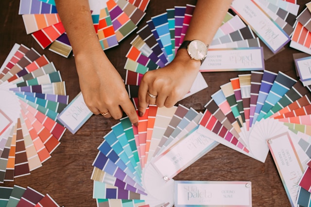
Why Think About Modern Palettes for Your Home?
When we talk about “modern palettes,” we’re not just referring to trendy colors. We’re talking about combinations that reflect the current moment: a stronger connection to nature, visual comfort, practicality, and, of course, aesthetics. Choosing a color palette is like choosing your home’s soundtrack. It sets the rhythm and mood of your spaces.
Incorporating the right colors goes beyond personal taste — it’s about enhancing functionality and well-being. Think about how you feel in a softly lit room versus a bold, dark-toned office. These emotional reactions are no coincidence — they’re deeply tied to how colors affect the brain.
If you’re furnishing or renovating a space — or just want to refresh a room without major work — this article will inspire you with practical, stylish ideas that match your personality. Let’s dive in!
1. Warm Neutrals with Terracotta Accents
This is one of the most beloved modern palettes in recent years. Warm neutrals move away from bland beige into tones like sand, vanilla, and almond, paired with terracotta, rust, and caramel.
Where to Use?
Bedrooms: provide comfort and coziness.
Living rooms: create a sophisticated and versatile base.
How to Apply
Picture an off-white wall, a beige sofa with brick-toned cushions, and a ceramic vase in a burnt hue. Voilà — a warm and stylish atmosphere.
Extra Tip
This palette pairs well with natural textures like light wood, cotton, linen, and sisal. Add layers like throws or neutral rugs to create depth.
2. Petrol Blue and Sage Green
Looking for sophistication without sacrificing visual calm? This combination is ideal. Petrol blue brings depth and elegance, while sage green adds freshness and a natural vibe.
Where to Use?
Home offices
Modern bathrooms
Bedrooms needing a refined touch
Examples
Paint half a wall in petrol blue, add sage green shelves, and complement with white and gold accents. It’ll look straight out of a magazine.
Combination Tip
Opt for matte metals (black or gold) and slim frame artwork. Accent lighting and velvet textures enhance this palette’s luxurious feel.
3. Graphite Gray with Gold Accents
Classic yet contemporary, graphite gray has become the new black in modern palettes. It’s neutral but full of attitude.
Where to Use?
Sophisticated dining rooms
Stylish kitchens
Balconies or gourmet spaces
How to Use Without Overdoing It
Apply graphite gray on walls or cabinets and highlight with gold in handles, fixtures, or decor.
Pro Tip
Combine with materials like glass, stone, or dark wood for added texture and depth. Under-cabinet lighting enhances golden details beautifully.
4. Burnt Pink + Moss Green
This unexpected combo works wonderfully. Burnt pink brings discreet elegance and softness, while moss green delivers an earthy, grounded balance.
Best Applications
Master or teen bedrooms
Creative home offices
Chic powder rooms
Real-Life Inspiration
Use pink on drapes or an accent wall and green in smaller furniture pieces like a console or chair. Add a mid-century piece to anchor the space.
5. Lavender with Soft Neutrals
Lavender is trending! It’s fresh, youthful, and surprisingly refined, especially when used in soft and airy color stories.
Where to Use?
Children’s rooms or feminine bedrooms
Home offices
Meditation or reading nooks
Stylish Pairing
Lavender + off-white + light wood makes for a gentle and modern palette. Add greenery for a cozy, spa-like vibe.
Use with Care
Let lavender serve as the accent while the rest stays neutral to avoid visual clutter. Pair with diffused light and minimalist pieces.
6. Matte Black with Icy White
A favorite for contrast lovers and minimalists alike. Matte black is bold and best used in kitchens, bathrooms, and statement architecture.
Best Settings
Custom kitchens
Modern bathrooms
Entryways
How to Balance It
Use icy white for walls or floors and add black through accents like faucets, lights, hardware, or chairs.
Bold Tip
Mix in light woods to soften the stark contrast. Rounded furniture or lighting can bring gentle balance to the composition.
7. Olive Green with Earth Tones
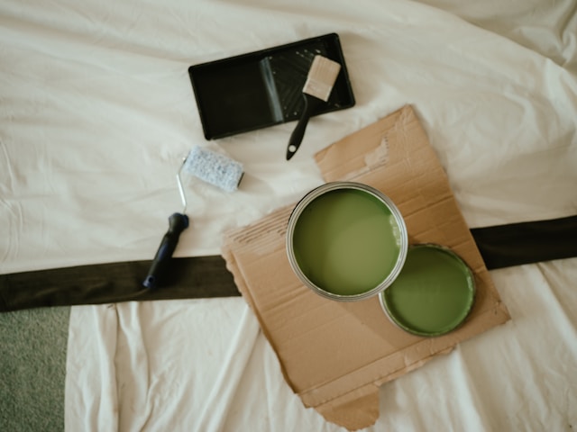
A hit among those who want to bring nature indoors. So warm and inviting you’ll want to linger in the space.
Where It Works Best
Living rooms
Balconies
Cozy bedrooms
How to Use
Paint an accent wall olive green or use it on large furniture like a bedhead or sofa. Layer in cushions and throws in rust, clay, or sand tones.
Finishing Touch
Include woven textures and handmade ceramics to deepen the natural aesthetic.
8. Mustard and Navy Blue
Vibrant and full of personality. Mustard offers a retro punch, while navy brings depth and elegance.
Where It Works
Trendy living spaces
Creative bedrooms
Modern offices
Balancing the Duo
Let navy dominate the large areas (walls, sofas) and bring in mustard with accessories: cushions, artwork, chairs, or lighting.
Style Tip
Pairs beautifully with gold and dark wood. Add geometric or vintage patterns for even more flair.
9. Greige with Cobalt Blue
This palette merges neutral comfort with bold character. Greige serves as a timeless base, while cobalt blue adds an artistic, curated feel.
Where to Use in Style
Elegant dining rooms
Creative offices
Contemporary bedrooms
How to Apply
Use greige on walls and major surfaces, and introduce cobalt through furniture, artwork, or designer accents.
Designer Trick
Combine with matte black or dark bronze for added refinement. Layer in different shades of gray for visual depth.
10. Clay with Soft Gray-Blue
Perfect for creating a space that’s grounded yet breezy. Clay evokes warmth, while soft gray-blue introduces calm and a subtle urban tone.
Best Uses
Guest bedrooms
Open-plan areas
Relaxation or reading nooks
Everyday Use
Paint one wall in clay and introduce the blue-gray tone through fabrics like drapes or accent chairs. Works well with concrete floors or light wood.
Ideal Complements
Finish the look with natural fibers (jute, straw), ceramic details, and warm lighting. Deep green plants add a final touch.
Why It Works
This blend of opposites — earthy clay and airy gray-blue — strikes a visual balance that radiates comfort, calm, and personality.
Checklist: How to Apply Modern Palettes at Home
✔️ Evaluate the room’s natural lighting
✔️ Choose up to three main tones per space
✔️ Use textures to enrich the palette
✔️ Test paint samples before making decisions
✔️ Match furniture and décor within the palette
✔️ Avoid excess — balance is key
✔️ Blend colors with natural materials
✔️ Observe how colors shift throughout the day
✔️ Design each room individually, but consider the whole
✔️ Leave room for future updates
Modern Palette x Décor Style Combinations
| Décor Style | Ideal Modern Palette |
|---|---|
| Minimalist | Matte black + icy white |
| Boho | Burnt pink + moss green |
| Industrial | Graphite gray + gold accents |
| Scandinavian | Lavender + soft neutrals |
| Rustic Natural | Olive green + earth tones |
| Contemporary | Petrol blue + sage green |
| Updated Classic | Warm neutrals + terracotta |
| Urban Elegance | Greige + cobalt blue |
| Creative & Eclectic | Mustard + navy blue |
| Organic Contemporary | Clay + soft gray-blue |
Modern Palettes and Well-being: The Invisible Link
Did you know colors directly influence our mood, productivity, and sense of well-being at home?
- Light and warm tones: boost coziness.
- Cool and soft shades: reduce anxiety and promote calm.
- Bold contrasts: enhance focus and energy.
A well-designed home isn’t just about looks. It’s functional, balanced, and reflects how you want to feel daily. The right colors can energize you in the morning or calm your evenings — transforming your space into a powerful emotional ally.
Conclusion: Let Your Home Speak for You
Each of these modern palettes holds endless possibilities. They’re not rules but guides. What matters most is that you connect with the colors and what they represent for you.
Your home is an extension of you. Let it speak your story, your choices, your passions. And if you’re unsure where to start, pick a palette that moves you — the rest will fall into place.
Did you enjoy these ideas? Save this article for your next decorating session or share it with someone rethinking their home! The perfect inspiration might be just a palette away.

